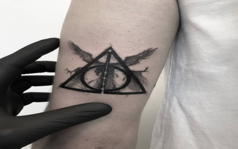
Honestly getting this Deathly Hallows tattoo idea stuck in my head was random. Saw some crazy detailed ones online, all shaded and massive, and thought nah… that ain’t me. Wanted something small, clean, simple. You know? Something you could put almost anywhere without screaming “LOOK AT MY TATTOO!”. So yeah, decided to try sketching out minimalist versions myself. Spoiler: easier said than done.
First Try: Way Too Fancy
Grabbed my sketchpad – thought, “How hard could it be? Just the circle, triangle, and line thingy.” Ha! Famous last words. My first sketch looked messy. Tried adding thickness variations to the lines, made the circle super precise… overdid it. It started looking like a weird technical drawing, not the cool symbol. Looked at my shaky handiwork and realized: Minimalism needs restraint, not extra stuff. Felt kinda stupid wasting that whole evening.
Scaling Back & Finding the Core Shapes
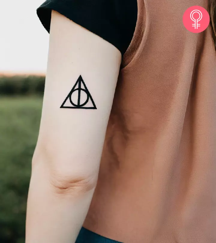
Threw that first mess away. Figured I needed to focus on the bare minimum. What makes the Deathly Hallows instantly recognizable? It’s those three shapes connected. So, I ignored all details. Just made:
- A straight line for the wand
- A simple triangle shape around it for the cloak
- A basic circle touching the top point of the triangle for the stone
No fancy thickness, no shading, no nothing. Just clean, single-weight lines. And boom! It suddenly worked. Looked instantly better and way simpler than my first disaster.
Testing Different Looks – The Top 3 Emerged
Got excited now. Started playing with slight variations on this super simple framework. Ended up liking three styles the most:
- The Classic Outline: Exactly what I described – pure, clean linework for all three shapes. Clear, sharp, undeniable. Looks good small.
- The Half & Half: Here’s the trick. Instead of outlining the whole triangle, I only drew the bottom half of the triangle outline, letting the wand line form one side. The circle stayed solid. This gave it a slightly different, almost puzzle-piece feel but still super minimal.
- The Broken Circle: This was a happy accident. Was drawing fast, my circle wasn’t perfect – the line didn’t fully connect at the bottom where it meets the triangle. Instead of fixing it, I kept it. A small gap in the circle right there looked surprisingly cool and intentional, adding a bit of texture without any bulk. Subtle difference, big impact.
Took pictures of all three sketched designs with my phone, comparing them side by side. Which one felt right? Honestly, all three nailed the minimalist vibe. The Broken Circle felt the most unique to me, personally.
The Moment of Truth (and Needles)
Alright, time to commit. Found a local artist known for clean, fine linework. Showed them my phone. “These three,” I said. “Super simple lines.” We talked placement (went with inner wrist – small and personal). The artist agreed they were solid designs and easy to execute well. Sat down… a little pinch… and honestly, it took less time than my first sketch! Just smooth, simple linework. Ended up choosing the Broken Circle version. Held my breath when they wiped it off… and grinned. Perfect. Tiny, meaningful, zero fuss. Exactly what I wanted from the start.
Moral? Forcing detail ruins symbols. Letting the shapes breathe and keeping it stupid simple works magic. Still love my tiny Hallows months later – no regrets, just happy I didn’t overcomplicate it.


